User Onboarding
Get them to stay
At-A-Glance
New users were dropping off fast after signup. I ran research to find out why, redesigned onboarding around a personalised first collection, and validated it with usability testing before shipping.
My Role
Head of Product Design - User Research, Ideation, Rapid Prototyping, UI Design
Team
iOS Developer
Android Developer
QA Engineer
Timeline
Mar 2023 - May 2023
Tools
Figma
The Problem
Drop-off, week 4 → 5
45%
Total drop-off from signup
93%
There was a significant drop-off in new user retention: 45% of users stopped opening the app between week 4 and week 5 alone, compounding to a 93% total drop-off from the date of signup. Keeping new users engaged through their first weeks was critical to maintaining a high volume of quality, long-term users.
The Research
Quantitative
- By week 5, 93% of users had stopped opening the app.
- Of the 7% who were still active past week 5, 97% had created at least one collection and added three or more items.
- Of the 93% who churned, only 16% had ever done the same.
Qualitative
Method: Video calls with individual users
Criteria: Located in the US, signed up between 5–8 weeks ago
Goals
- Understand the factors influencing user engagement and drop-off
- Analyse user behaviour and decision-making
- Identify opportunities to improve retention
Key questions
- 1. What motivated you to sign up for the app, and how did you initially intend to use it?
- 2. Can you walk us through your experience using the app? What worked well, and where did you face challenges?
- 3. What factors influenced your decision to either continue engaging with the app or stop using it after a few weeks?
Key Insights
1. Users struggle with onboarding & understanding the platform
Many felt overwhelmed because the platform differed from familiar tools, and a lack of clear guidance made it hard to see how it fit into their daily workflow.
2. Users need more direction & motivation to engage
New users struggled to identify practical use cases, which led to disengagement. Structured onboarding, suggested use cases, or interactive guidance stood out as ways to improve retention.
3. Content sharing & collaboration need to be simplified
A confusing sharing UI led to frustration; a streamlined process with clearer instructions could help users connect with like-minded people and stay engaged.
Ideation & Hypothesis
Highlighted directions are the ones we moved forward with.
Optimise onboarding
Improve onboarding to be more engaging and personalised.
Personalisation
Tailor content, recommendations, and interactions around the user's preferences.
Reduce friction in existing flows
Simplify current flows to remove user drop-off.
Improve notifications
Enhance the effectiveness of push notifications.
Gamification
Implement challenges and rewards for user interactions.
Provide users with a personalised experience when creating collections. By tailoring content to what people actually do, users wouldn't need to go to social media or the explore page for ideas on what to create.
The Approach
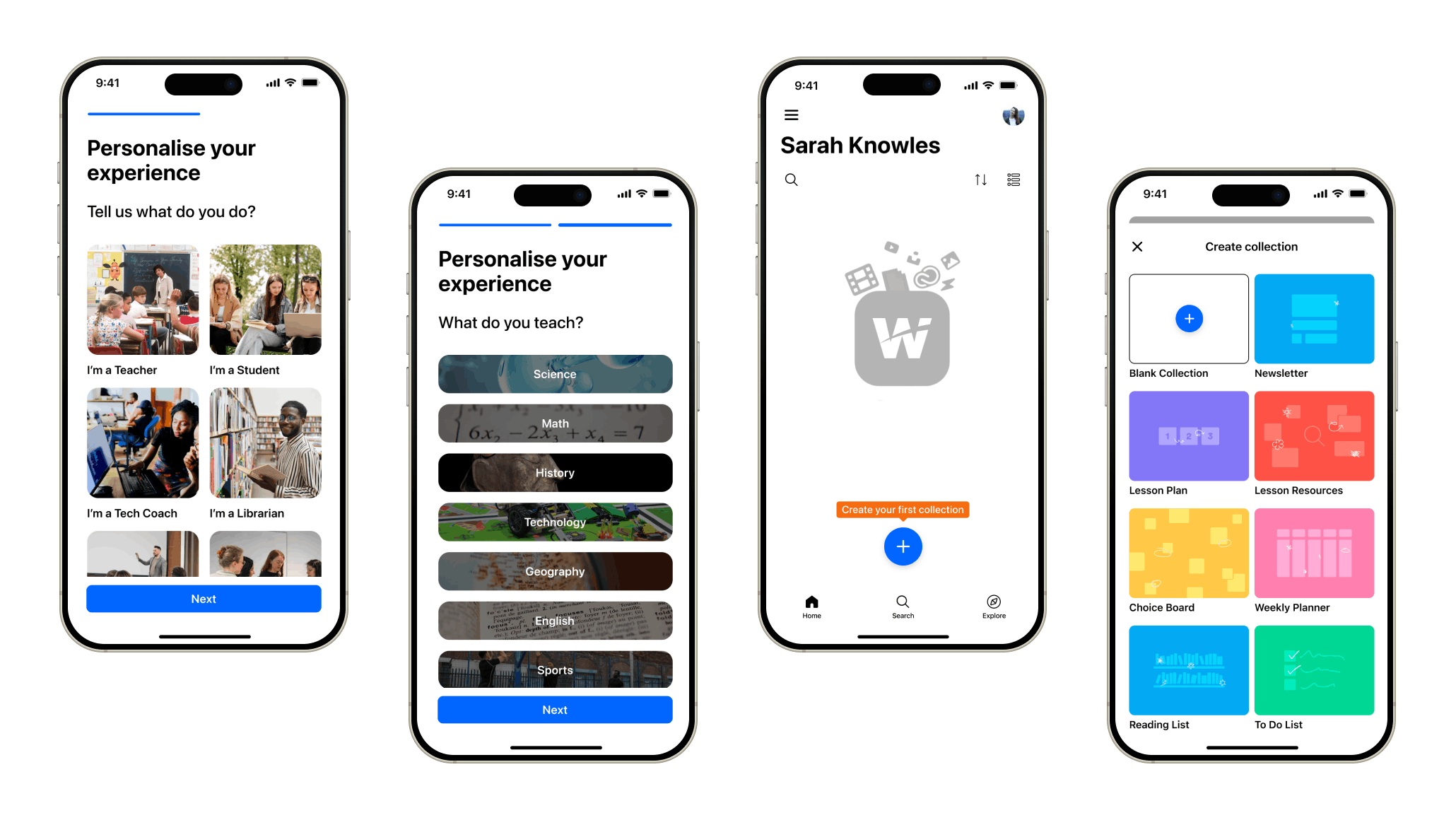
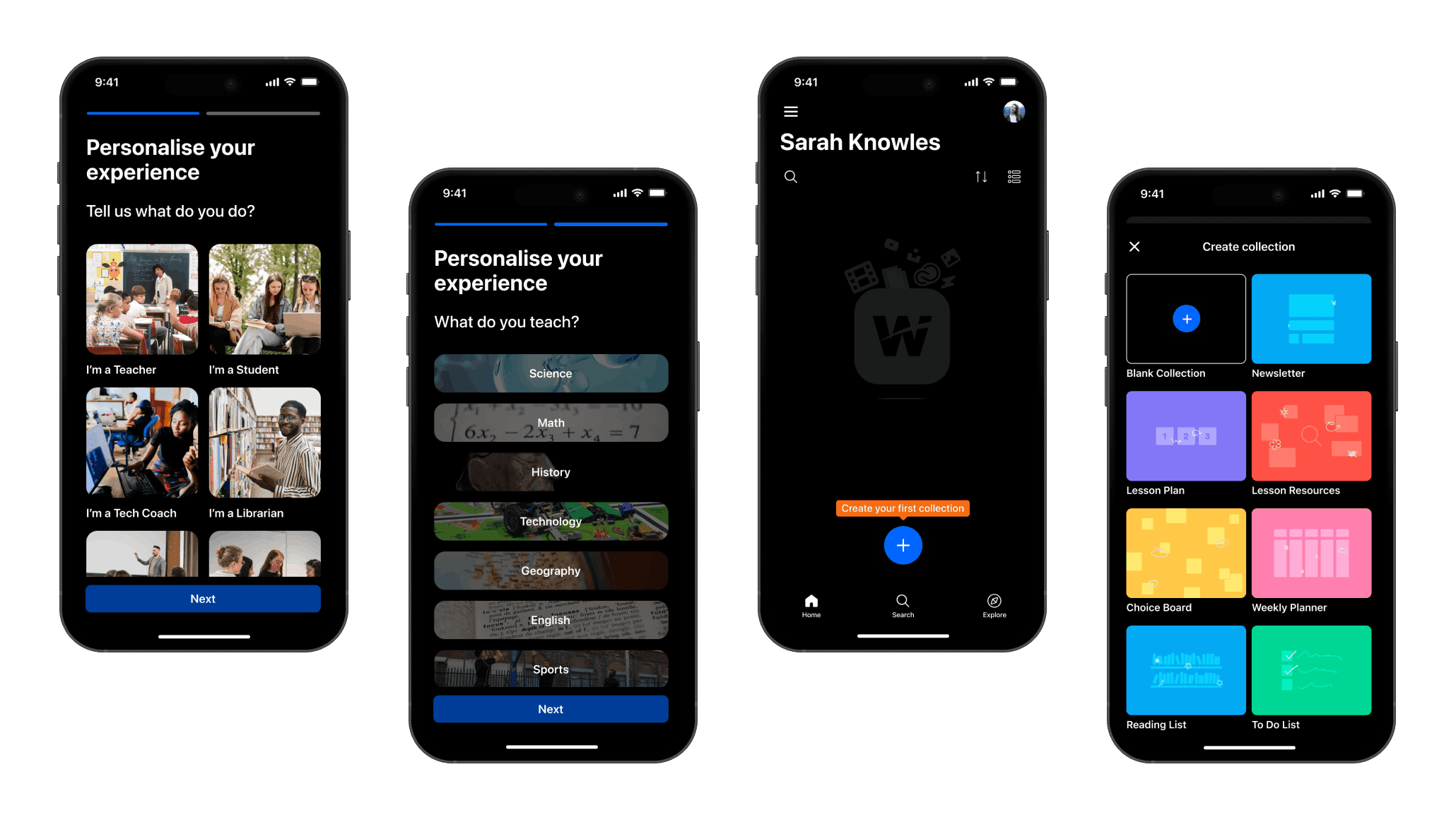
I replaced a generic, one-size-fits-all onboarding step with a short preferences flow, then used those answers to turn the empty Home screen into a personalised template picker. A new user's very first collection was already tailored to what they'd told the app about themselves.
From sketch to structure
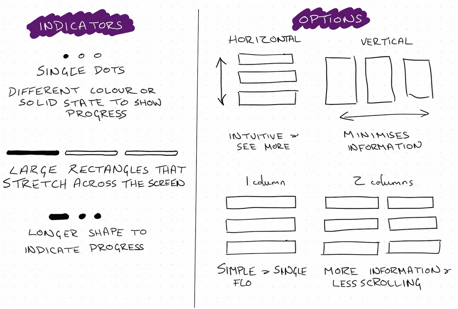
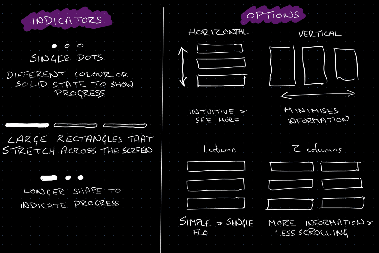
Early sketches tested a single open-ended question against a step-by-step flow with one question per screen, and iterated on the progress indicator (dots vs. bars) and option layout (single column vs. two-column grid) before settling on a format that felt quick without hiding information or breaking as more options were added.
Prototyping account setup
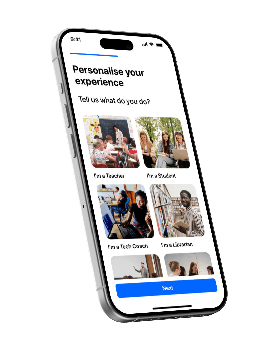
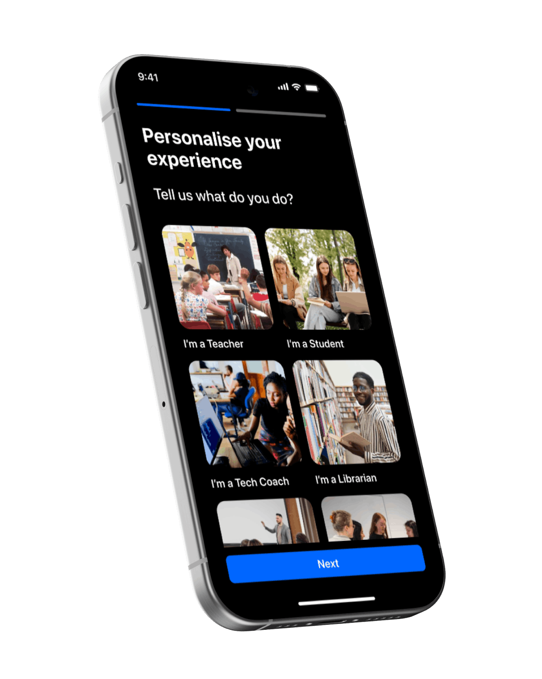
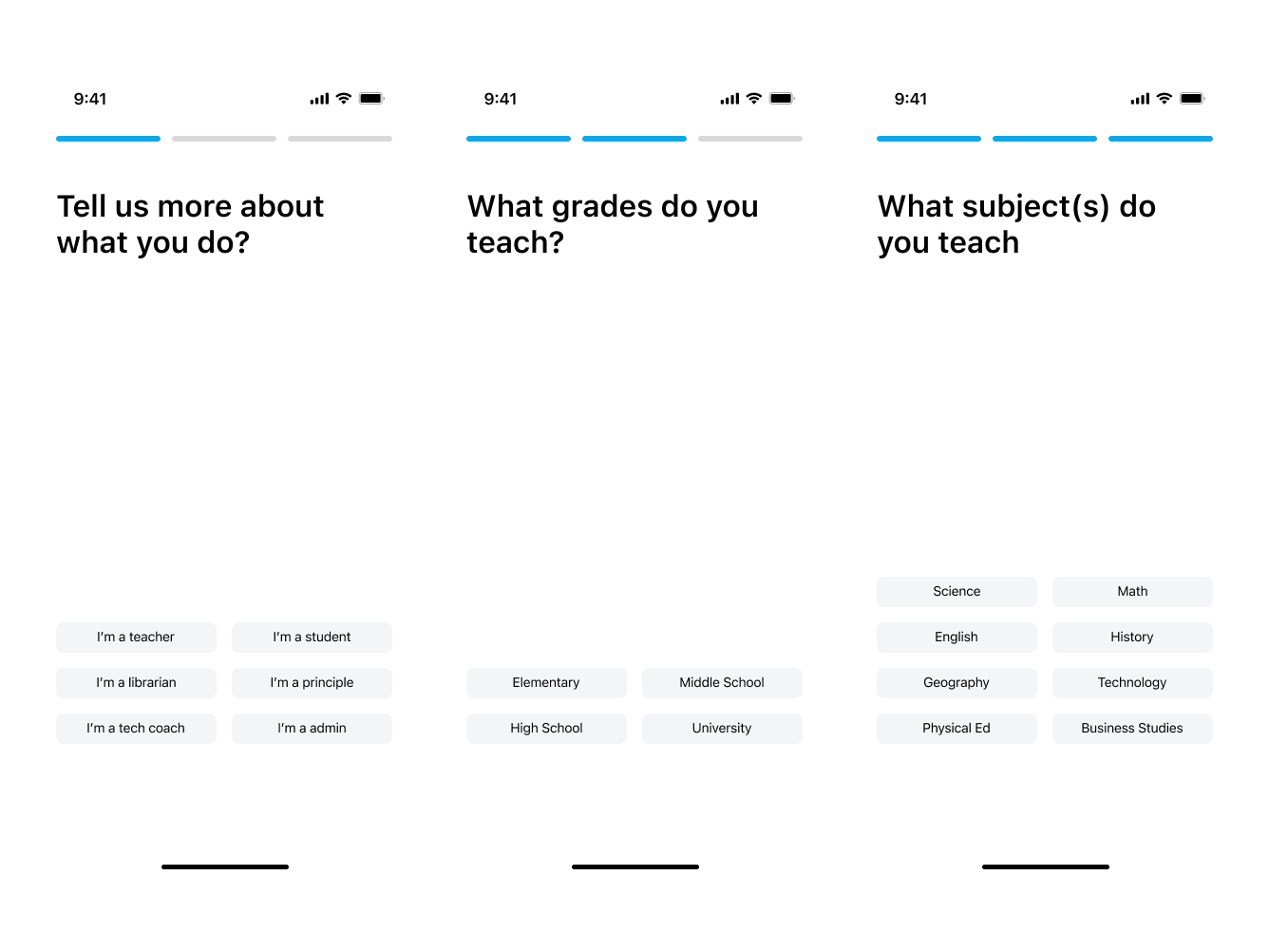
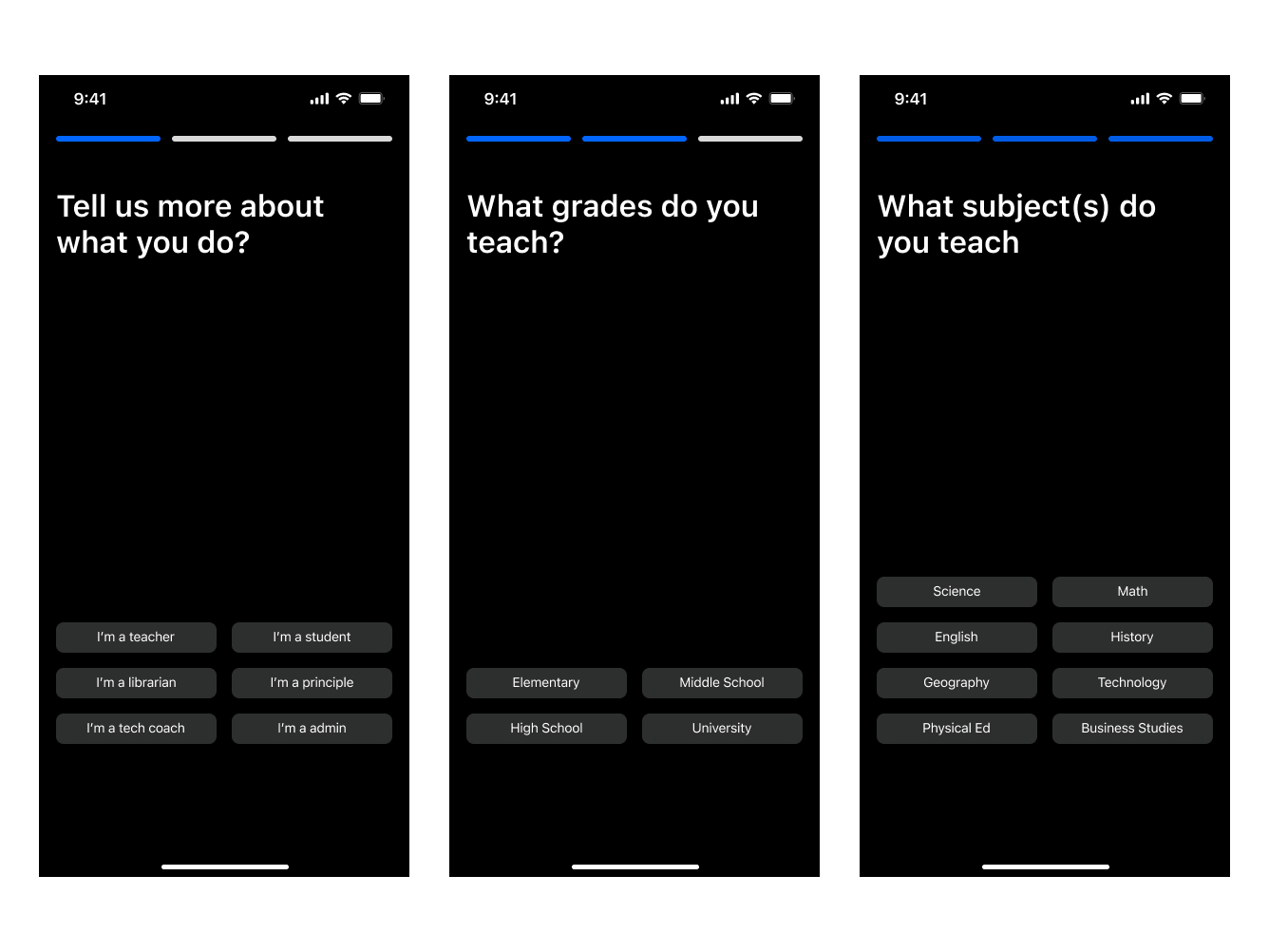
Built a two-step onboarding flow: role first, then a subject-specific follow-up, so every new account carried enough signal to personalise what came next.
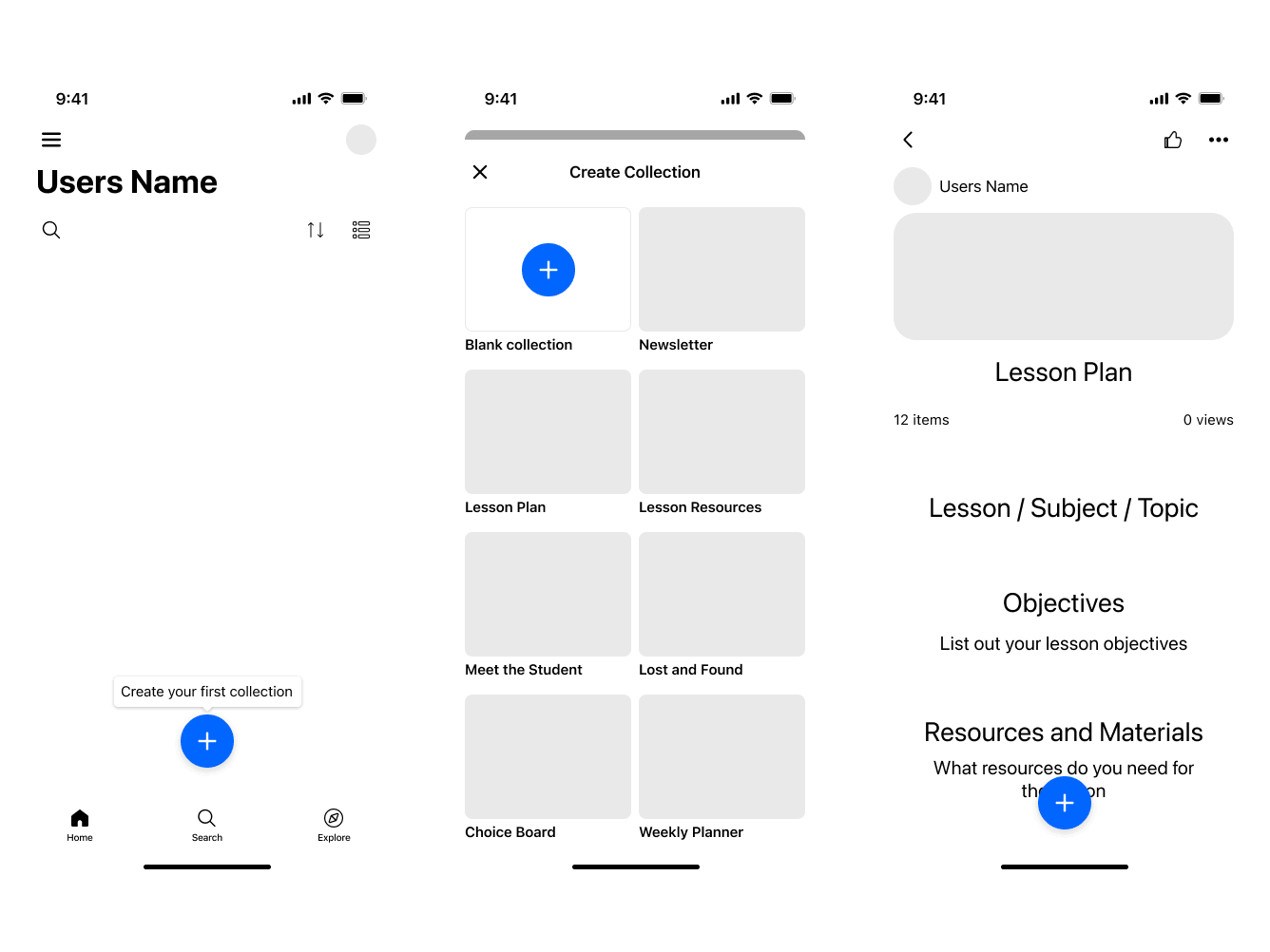
Prototyping collection creation
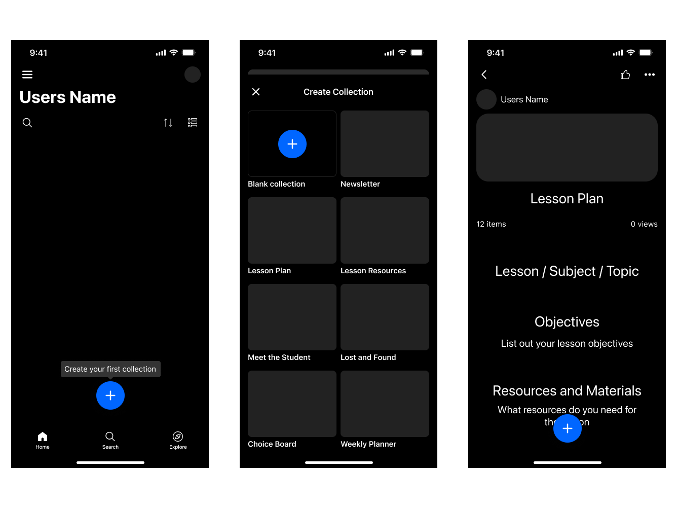
When users chose to create a collection, they could start blank or pick from a set of templates matched to their onboarding answers. A teacher would see Lesson Plan, Lesson Resources, or Meet the Student, each pre-filled with the structure that use case usually needs.
Validating with Users
Participants: Educators in the US who had not used Wakelet before
Method: Remote usability testing through recorded sessions
Goals
- Evaluate the ease of use and understanding of the prototype
- Identify usability friction points that may hinder engagement
Scenarios tested
- 1. An educator knows what to create and organise when using the platform for the first time
- 2. A teacher can work out how to integrate the tool into their classroom activities
Did you encounter any issues during account setup?
- No issues: 60%
- Didn't see the subject they teach: 25%
- Were hesitant giving the information: 15%
Why do you believe this information is being collected?
- Personalised experience: 85%
- Unsure: 15%
Did the template help you decide what to create?
- Yes: 100%
Could you find something to create?
- Yes: 95%
- No: 5%
The Journey, Before & After
Current
- Set up account
- How did you hear about us?
- Home
- Create collection
- Add content
Updated
- Set up account
- PreferencesNew
- Home
- Pick a templateNew
The Outcome
The redesigned onboarding shipped as an A/B test against the existing flow. The drop-off between week 4 and week 5 nearly halved, and users who created a personalised collection early were far more likely to still be active weeks later.
Week 4–5 drop-off
45% to 22%
Retention beyond week 5
7% to 10%
Users who created a collection but didn't return
+125%