Mobile App Design
A cleaner look and feel
At-A-Glance
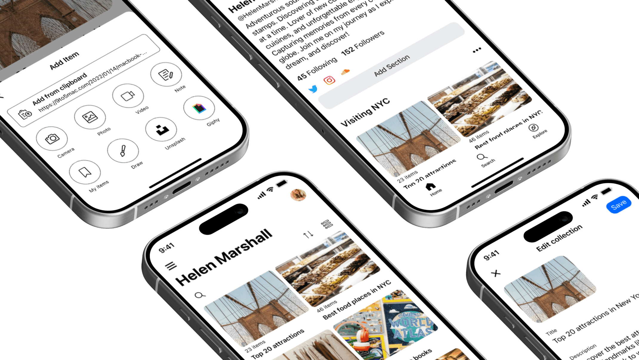
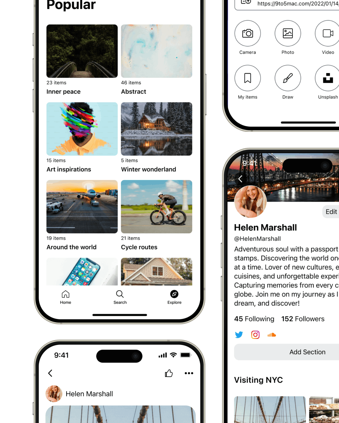
Wakelet is an EdTech platform used by millions of students and educators. I built a native, mobile-first design system for its iOS and Android apps, replacing an experience that had always been copied from the web.
My Role
Head of Product Design - Visual Design, User Research, Rapid Prototyping, Branding
Team
iOS Developer
Android Developer
QA Engineer
Timeline
Aug 2022 - Dec 2022
Tools
Figma
Highlights
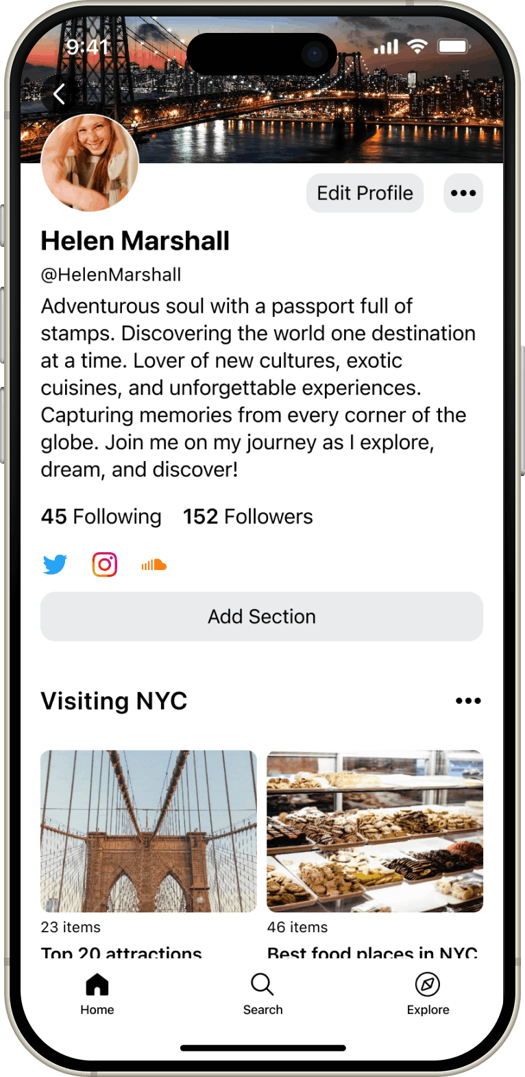
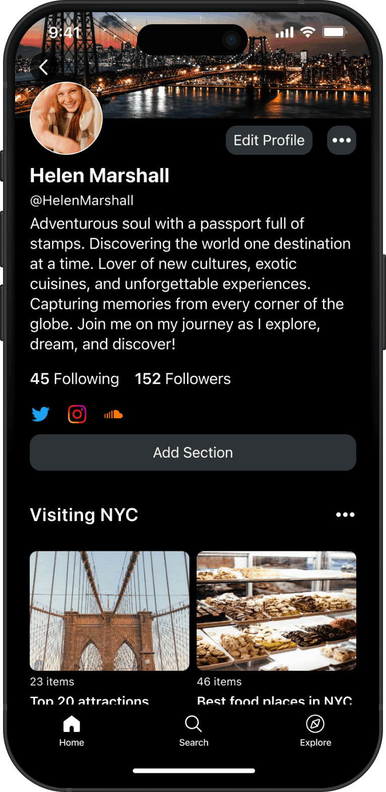
One system, three platforms
Buttons, spacing, and type now work the same way across web, iOS, and Android, instead of three teams solving the same problem three different ways.
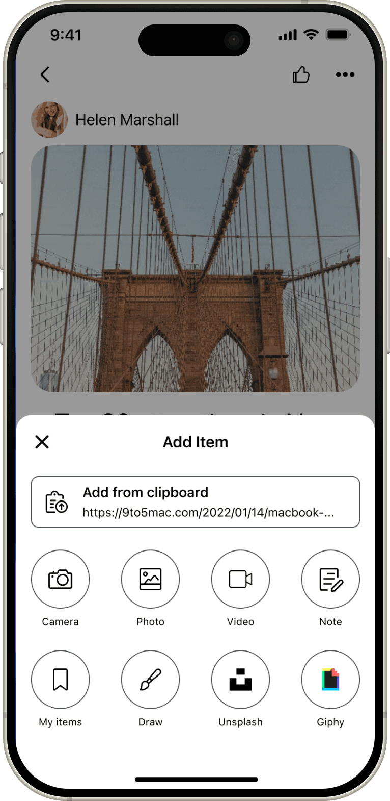
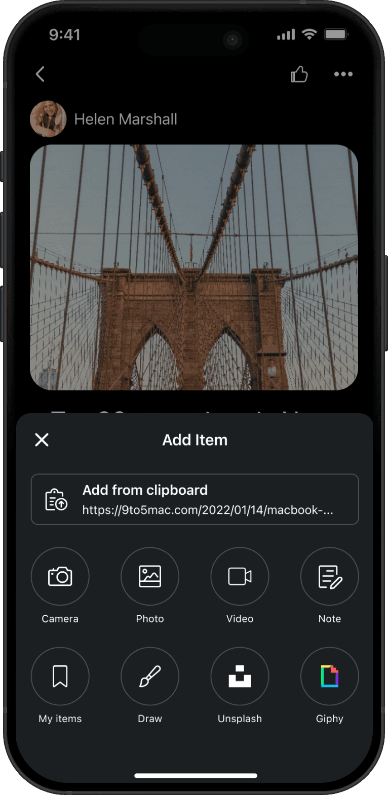
Native to each platform
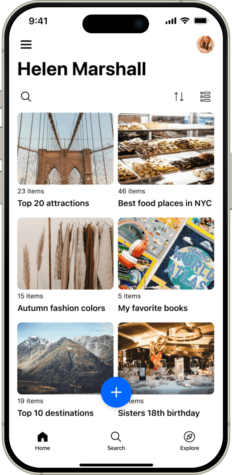
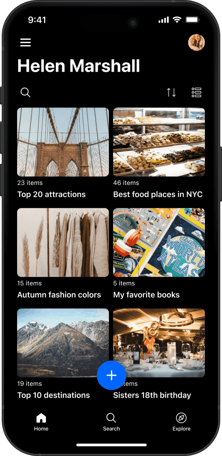
iOS and Android components follow their own platform conventions, not a forced pixel match, so every screen still feels like it belongs on its OS.
Accessible by default
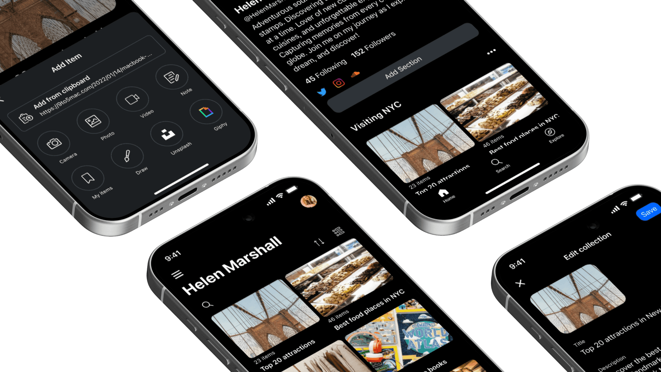
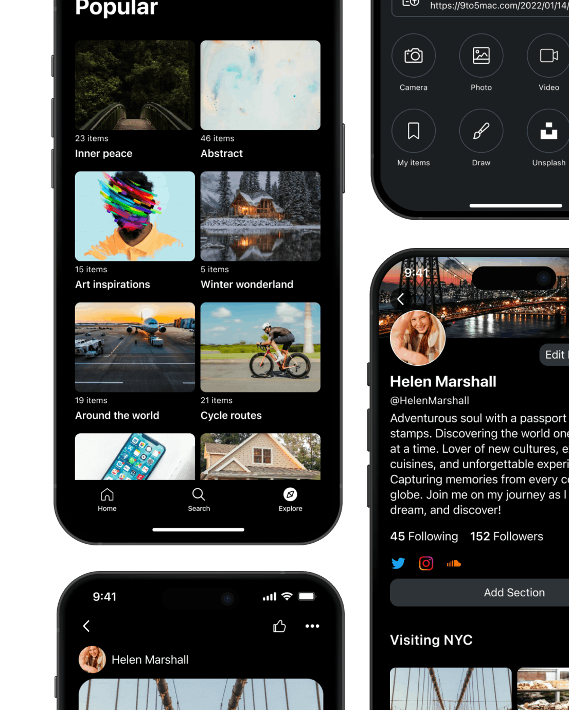
Every component works in light mode, dark mode, and at whatever text size the device is set to, without losing content or breaking layout.
The Problem
Wakelet's mobile apps had always been built as a copy of the web app. As more classrooms relied on mobile and tablet devices, that approach was no longer good enough. Users were struggling to use the app, but it wasn't clear exactly why.
The Solution
A design system built specifically for mobile, using native components on each platform and atomic design methodology, so code quality, performance, and accessibility were built in from the start.
The Discovery
I ran 8 interviews with educators to understand how they actually used mobile and tablet devices in the classroom. Mobile and tablet usage had already grown 150% organically as schools moved to 1:1 devices, but the app hadn't kept up: 7 of the 8 educators said it felt slow, confusing, and disruptive.
“During group projects, students can be using 2-3 apps at one time, as well as taking photos and searching the web. To organise all this information into the Wakelet app requires repetitive actions that result in students becoming demotivated and frustrated when using the app.”
Alongside the interviews, I audited every screen of the existing app. Buttons, typography, and spacing had drifted apart across web, iOS, and Android, with no shared visual language holding them together.
Together, the interviews and the audit pointed to the same root cause: the app mirrored the web app instead of being built around how people actually used a phone or tablet, so it was missing functionality mobile users expected.
The Approach
Justify every component
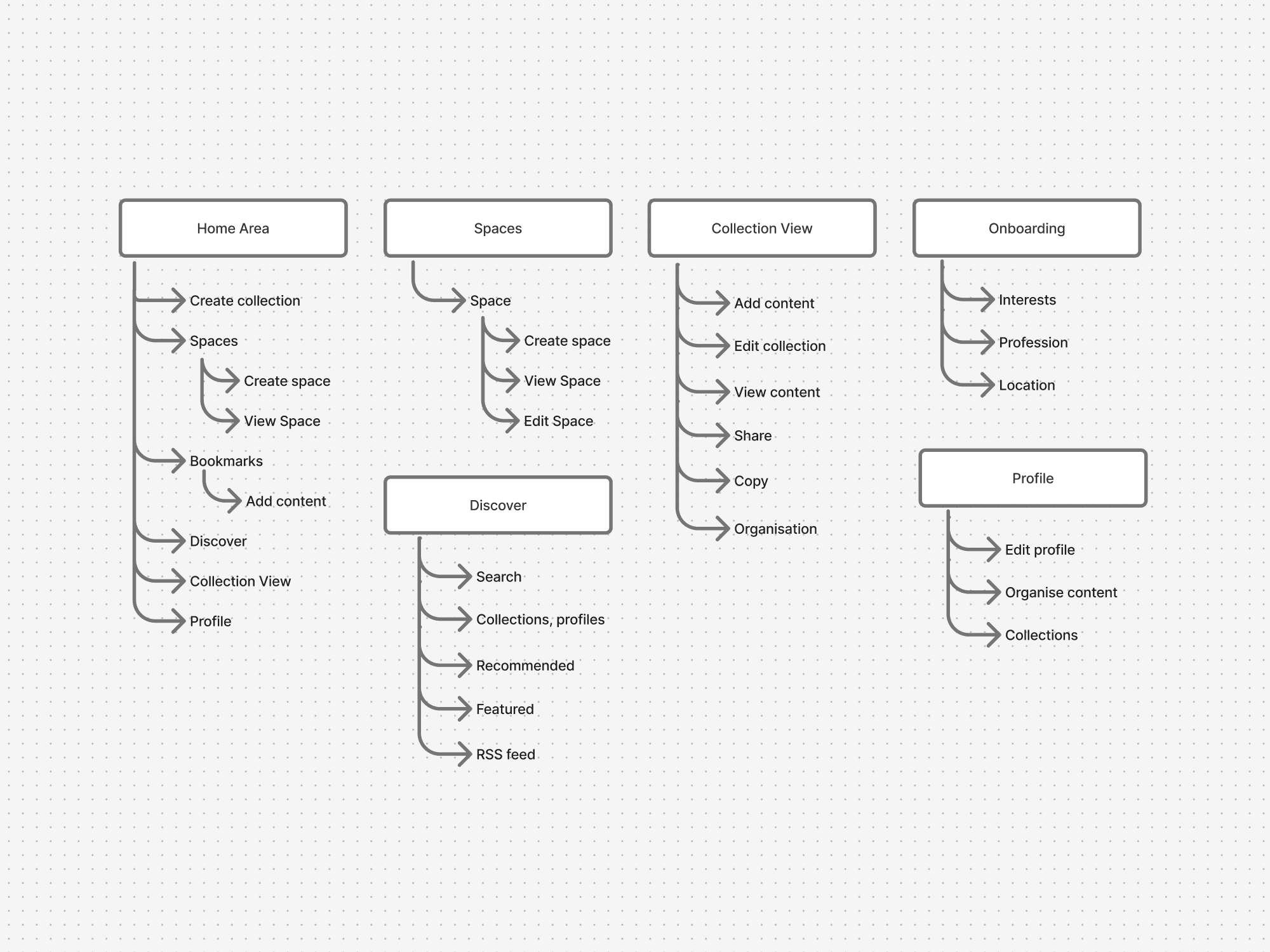
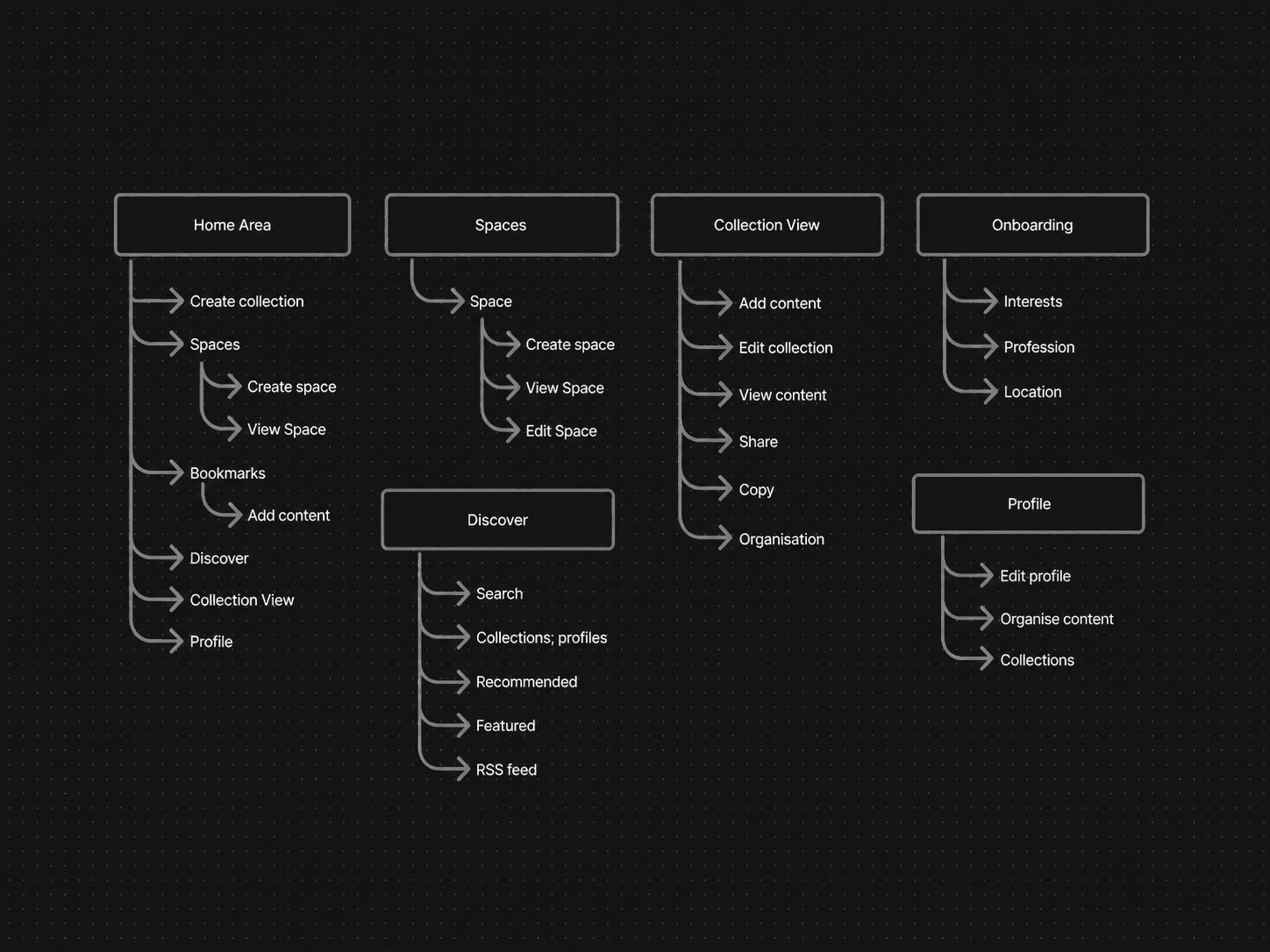
The audit became the evidence base for the design system. It also traced how pages connected to each other: navigation followed the web app's structure almost exactly, so pages and functionality that only made sense on a full desktop screen were still there on mobile, and users had to navigate through them regardless. Every new component had to fix a real inconsistency like this, not just look tidier, and that discipline held as the system grew, so new additions were justified by evidence, not opinion.
Platform native
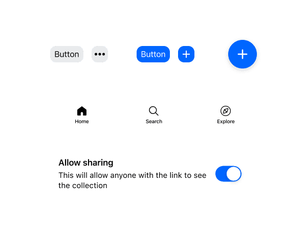
I built each platform on its own foundations instead of forcing a single custom UI across both: iOS on Apple's UIKit, Android on Google's Material Design. The same component doesn't always look identical as a result, but it keeps the same interaction model and visual language, so it still feels native to its OS.
Accessibility first
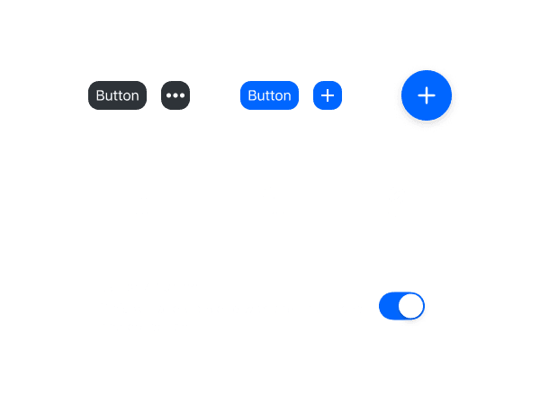
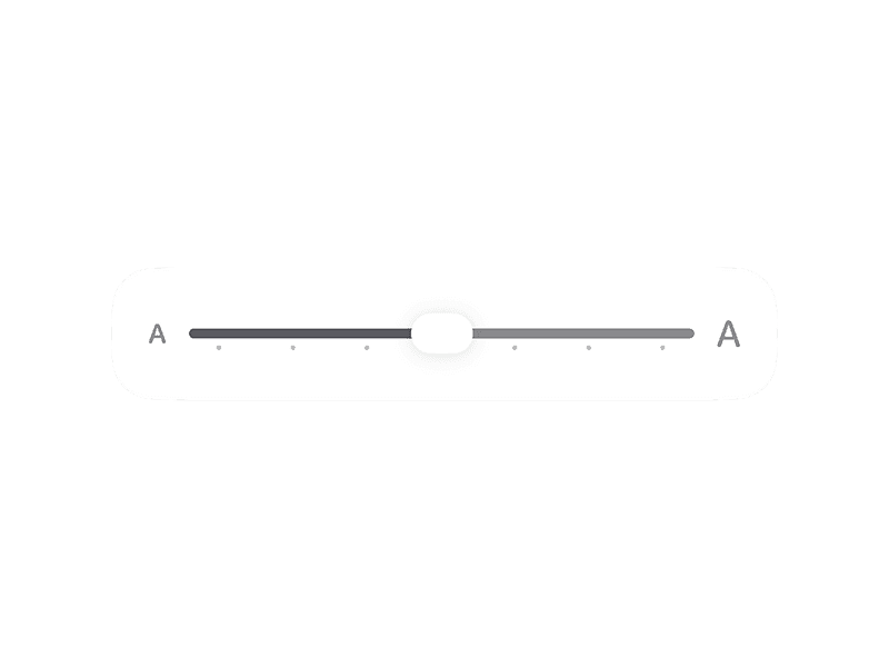
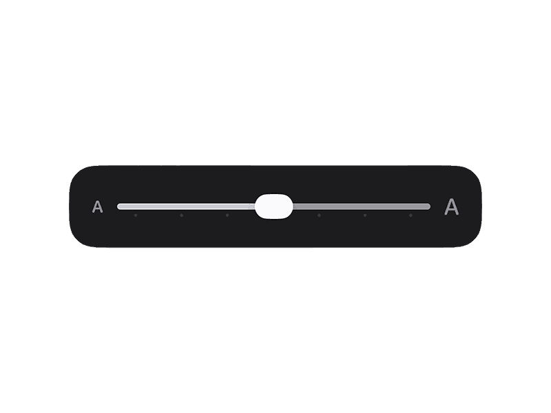
Every component supported light mode, dark mode, and the device's own text-size settings, instead of a single fixed scale. The harder part was making sure that flexibility didn't break the layout: components had to be resilient enough that larger text settings never truncated content. By building on native components, screen-reader support, dynamic type, and contrast handling came from the platform itself instead of being rebuilt from scratch.
The Outcome
With a consistent UI across both apps, high-fidelity mockups weren't always necessary, and the pre-built components let the team move 25% faster across design and implementation as the product scaled. After launch, usage kept climbing on both platforms, and users described the app as performing much better, feeling intuitive, and staying focused on the functionality that mattered most in the classroom.
Team design efficiency
+25%
iOS usage growth
+210%
Android usage growth
+360%